Stella Jean’s Ice Cream
-
Deliciously different flavours and a penchant for creativity in all that they do sets Stella Jean’s apart as California's favorite small batch ice cream joint. It’s no wonder we jumped at the opportunity to sprinkle our own creative toppings on their brand with a fun and funky visual identity refresh.
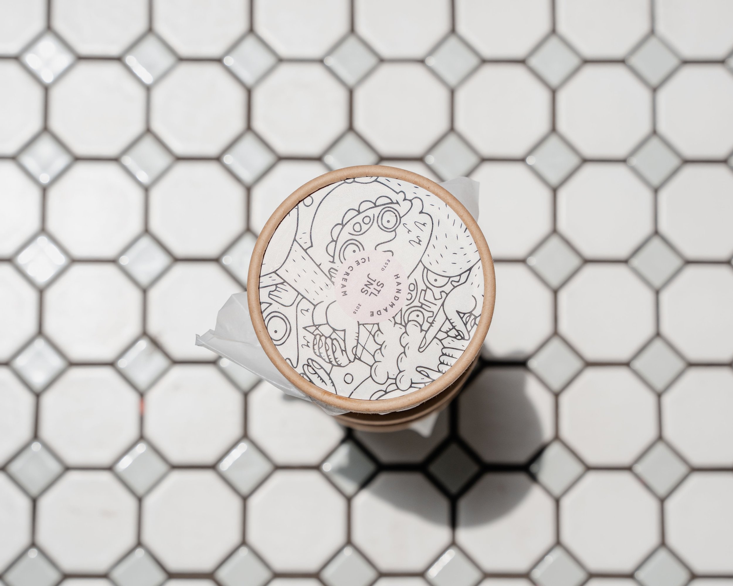
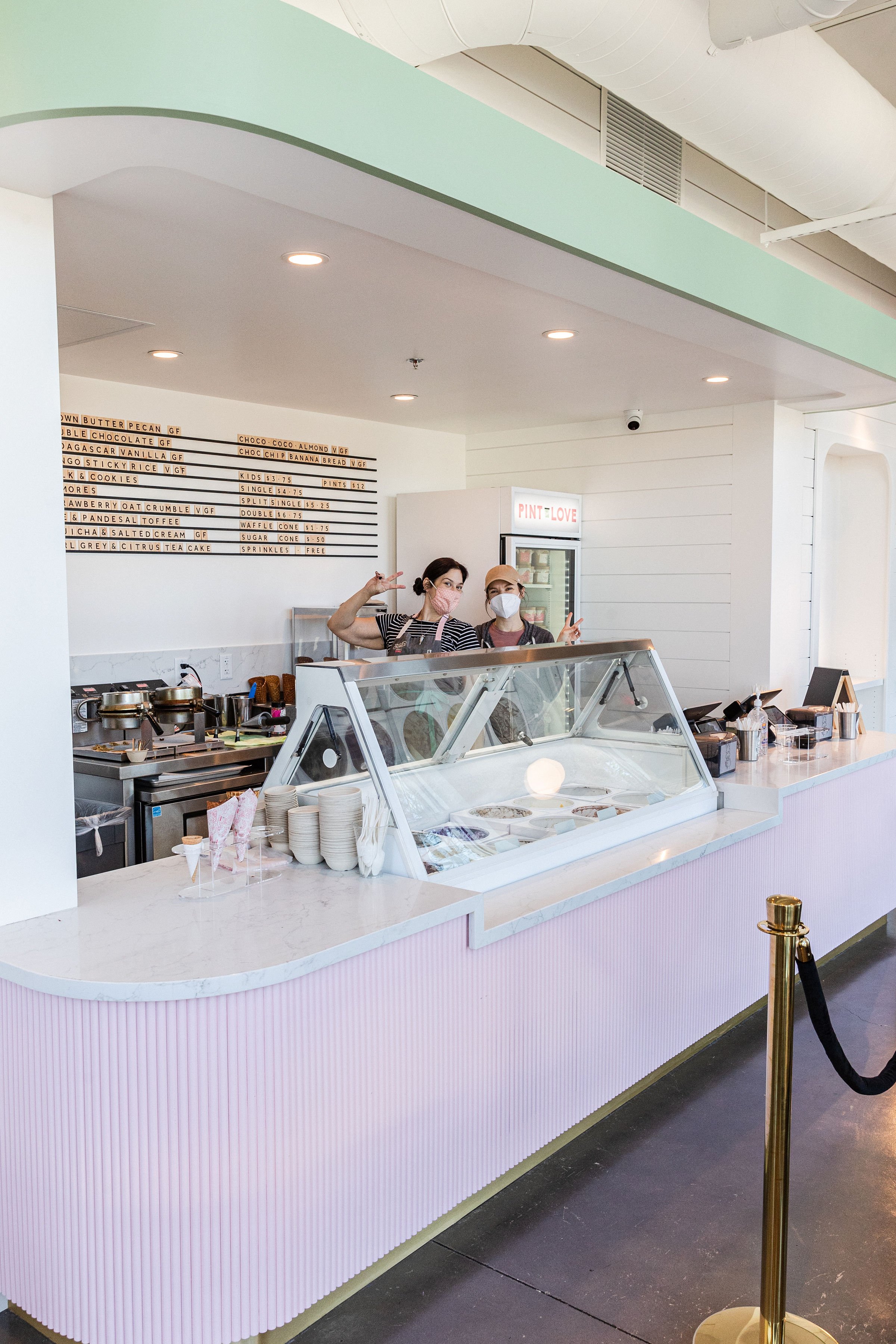
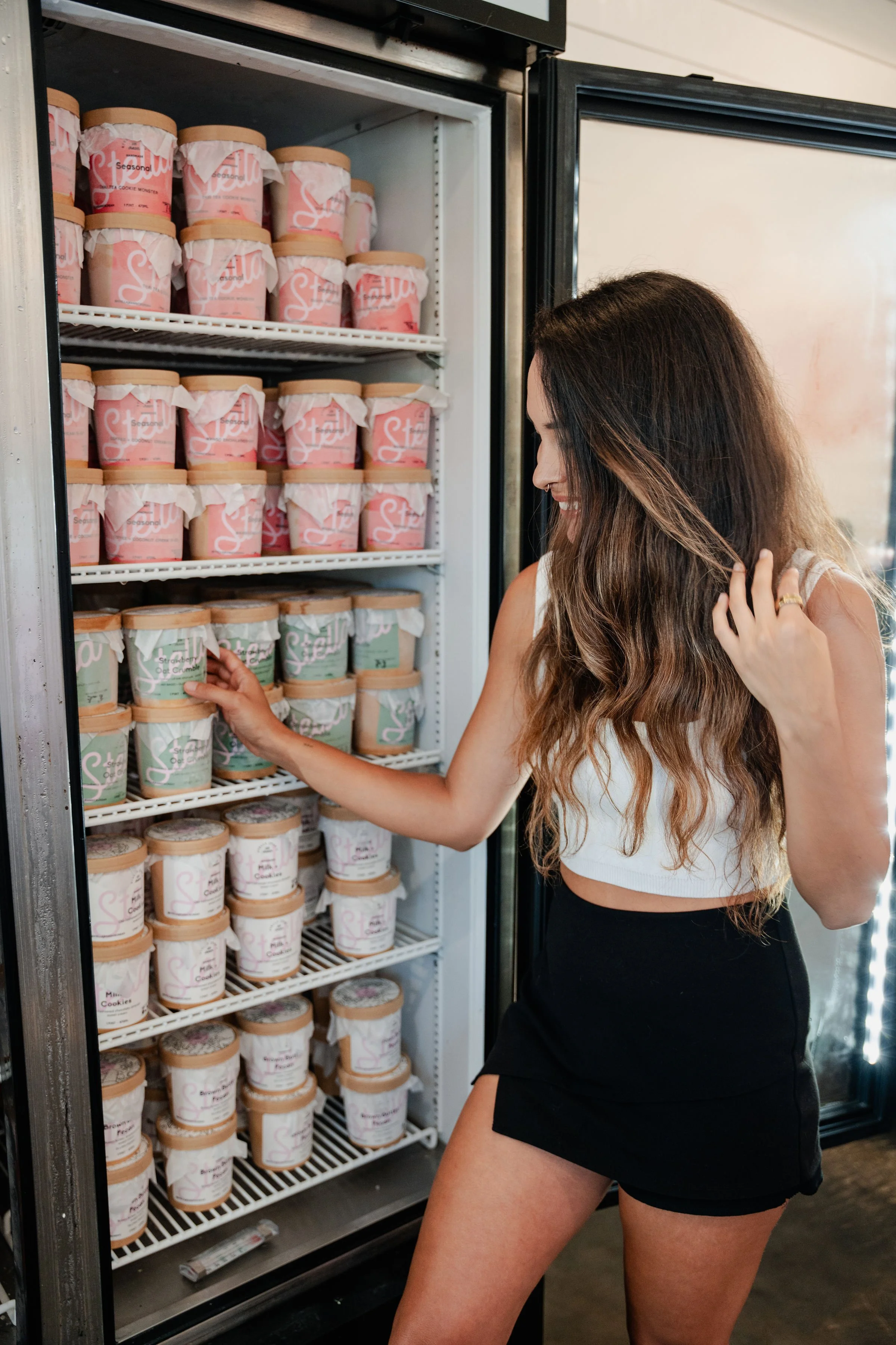
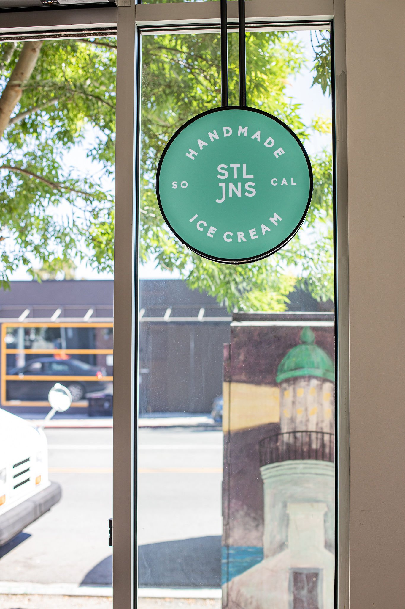
Wanting to maintain the spirit of their existing logo, we reworked the handwritten letterforms and paired the pleasing new wordmark with a modern, edgy sans. We built out the logo suite to include a variety of secondary wordmarks and badges, allowing lots of room to play when extending the brand across multiple assets. The new palette is built around their signature coral pink, pulling in soft and creamy tones as well as an earthy olive green that speaks to their many plant-based ice cream varieties. All of these hues are anchored and emboldened by soft black, which works to include older branded elements such as the murals that bedeck the walls of their scoop shops.
The Project
Brand Identity, Brand Guidelines, Concepting, Copywriting, Digital Wayfinding Experience, Illustration, Merch and Product Design, Package Design, Signage, Strategy, Visual Identity, Wayfinding, Website Design.
Our Team
Caitlin Wharton (Creative Director), Madison Newey (Senior Designer & Illustrator), Jadel Baldrey (Project Management), Tori English (Illustration), Jean Merrick (Designer).
Other Friends
Local SoCal Interior Design teams, Lauren Asta (Monster Illustration), Israel Palacio (Photography). Special thanks to the wonderful founders Steven & Gan whose partnership in this project was invaluable to its sweet success.


